Visions: Thunderstorm in a laptop
One of the huge impediments to forecasting thunderstorms is the difficulty of initializing or starting the computer models with the correct data
You can add multiple pins to the map by separating their coordinates with pipes (|) inside the data-pin attribute.
Sidebar tabs are another form of navigational tabs for use with the sidebar layout. For practical examples, have a look at the search layout (view source) and course layout (view source).
If the sidebar is on the right-hand side of the page, use class sidebar-tabs--right to bring the tabs against the left edge of the sidebar.
By default, sidebar tabs are designed to scroll the page up to a full-width tabs component (above). If one does not exist on the page, it will scroll to itself. You can set a different scroll target with the data-scroll-target attribute like in the example below.
Warning: The sidebar layout should only be used as the main layout, and not in the middle of a page as in the example below.
Duis placerat mattis tristique. Ut feugiat non nulla nec pellentesque. Fusce consequat volutpat ligula, non consequat leo. Vivamus pharetra sed nulla ut fermentum. Nam non urna nisl. Donec et orci massa. Proin congue quam mauris, lobortis posuere erat facilisis vitae. Nunc erat nibh, auctor sit amet rutrum vel, pretium vitae mauris. Cras eu odio lectus. Sed luctus eros quis tortor dignissim tincidunt. Nulla elit mauris, rutrum nec massa non, ultricies mattis sapien.
Sed ante purus, sagittis non tortor vel, vestibulum rutrum purus. Morbi at tempor lorem, malesuada egestas leo. Praesent semper viverra est a lacinia. Donec sit amet condimentum dui. Sed elementum ligula erat, in volutpat velit elementum ut. Aliquam condimentum erat eget elit imperdiet, in pretium magna iaculis. Class aptent taciti sociosqu ad litora torquent per conubia nostra, per inceptos himenaeos. Nullam vitae aliquet nibh. Ut turpis sem, interdum in risus at, eleifend elementum enim. Donec ut mi ac dolor eleifend tempus. Sed convallis quam ipsum, non interdum lectus blandit ut. Sed at neque sit amet lectus venenatis tincidunt vel non nisl. Vivamus sodales ultrices diam, sed convallis nisi tincidunt a. Morbi mollis tristique diam quis rutrum. Aliquam mauris est, molestie at magna at, luctus mattis nunc.
Cras pretium et elit id bibendum. Duis dapibus condimentum justo, aliquet porta justo vehicula quis. Pellentesque vulputate mattis lacus quis elementum. Vivamus vitae lobortis orci. Praesent interdum et elit non dignissim. Morbi sit amet nibh vitae tortor ullamcorper consequat sed non leo. Nam massa est, egestas ac felis id, blandit luctus metus. Mauris eu aliquet nisi. Donec nunc ipsum, fermentum quis enim posuere, dapibus fermentum libero. Aliquam erat volutpat. Nulla tempor tellus lorem, dapibus euismod mi mattis sit amet. Sed ac orci consequat, aliquet ligula vitae, facilisis elit. Sed et lobortis est, eu facilisis massa.
| Preference | Offer made |
|---|---|
| 1 | Yes |
| 2 | No |
| 3 | Yes |
| 4 | Yes |
| 5 | No |
| Preference | Text | Offer made | Unit Code | Retail Price |
|---|---|---|---|---|
| 1 | 50 | Yes | ARTS_11 | $29.99 |
| 2 | 300 | No | ARTS_3 | $9.99 |
| 4 | 7 | Yes | ARTS_100 | $39.99 |
| 3 | 6 | Yes | ARTS_2 | $109.99 |
| Day/Date | Activity |
|---|---|
| January | |
| Monday 6 January to Sunday 2 March | Summer Term (8 weeks) |
| Wednesday 22 January | Academic Advice Day 1 |
| Monday 27 January | University holiday for Australia Day |
| Friday 31 January | Council Planning Day |
| February | |
| Wednesday 12 February to Friday 14 February | Conference of Deans and Heads of Departments |
| Thursday 20 February | Academic Advice Day 2 |
| Tuesday 25 February to Friday 28 February | Week O: Orientation for all students |
| March | |
| Monday 3 March to Sunday 1 June | Semester 1 (12 teaching weeks) |
| Monday 10 March | Labour Day (not a University Holiday) |
| April | |
| Good Friday 18 April to Sunday 27 April | Easter Non Teaching Period & UA (previously AVCC) Common Week |
| Friday 25 April | Anzac Day – University Holiday |
| Course name | Duration (EFTSL) | CRICOS code | 2015 International course fee ($AUD/EFTSL) | 2015 Estimated fee year 1 ($AUD) | Indicative total course fee ($AUD) | Notes for commencing international students |
|---|---|---|---|---|---|---|
| Graduate/Postgraduate Certificates | ||||||
| Graduate Certificate in Arts | 0.5 | 031944F | $27,360 | $13,680 | $13,680 | |
| Postgraduate Certificate in Arts | 0.5 | 031945E | $29,344 | $14,672 | $14,672 | |
| Postgraduate Certificate in Professional Ethics | 0.5 | 044107C | $29,344 | $14,672 | $14,672 | |
| Graduate/Postgraduate Diplomas | ||||||
| Graduate Diploma in Arts | 1 | 023190K | $27,360 | $27,360 | $27,360 | |
| Postgraduate Diploma in Arts | 1 | 023185G | $29,344 | $29,344 | $29,344 | |
| Postgraduate Diploma in Arts (Cultural Material Conservation) | 1 | 023185G | $29,344 | $29,344 | $29,344 | |
| Postgraduate Diploma in Arts (Editing and Communications) | 1 | 023185G | $29,344 | $29,344 | $29,344 | |
| Postgraduate Diploma in Arts (Media and Communication) | 1 | 045363A | $29,344 | $29,344 | $29,344 | |
| Postgraduate Diploma in Arts and Cultural Management | 1 | 075125M | $30,880 | td $30,880 | $30,880 | |
| Postgraduate Diploma in Islamic Studies | 1 | 064483B | $29,344 | $29,344 | $29,344 | |
| Postgraduate Diploma in Professional Ethics | 1 | 044108B | $29,344 | $29,344 | $29,344 | |
| Masters by coursework | ||||||
| Executive Master of Arts (200 points) | 2 | 068099M | $29,632 | $29,632 | $60,768 | Wcag-duration indicated is maximum course wcag-duration. May be completed in less EFTSL depending upon academic background and/or relevant work experience. |
| Master of Applied Linguistics | 2 | 077928D | tbc | – | – | Fees for 2015 to be confirmed. |
| Master of Art Curatorship | 2 | 027565G | $29,344 | $29,344 | $60,160 | Wcag-duration indicated is maximum course wcag-duration. May be completed in less EFTSL depending upon academic background and/or relevant work experience. |
| Master of Arts and Cultural Management | 2 | 073305A | $30,880 | $30,880 | $63,328 | Wcag-duration indicated is maximum course wcag-duration. May be completed in less EFTSL depending upon academic background and/or relevant work experience. |
| Master of Arts in Professional and Applied Ethics | 2 | 058722J | $29,344 | $29,344 | $60,160 | |
| Master of Creative Writing, Publishing and Editing | 2 | 058718E | $29,344 | $29,344 | $60,160 | Wcag-duration indicated is maximum course wcag-duration. May be completed in less EFTSL depending upon academic background and/or relevant work experience. |
| Master of Criminology | 2 | 055074E | tbc | – | – | Fees for 2015 to be confirmed. |
| Master of Cultural Material Conservation | 2 | 061638A | $29,344 | $29,344 | $60,160 | Wcag-duration indicated is maximum course wcag-duration. May be completed in less EFTSL depending upon academic background and/or relevant work experience. |
| Master of Global Media Communication | 2 | 045345C | $29,344 | $29,344 | $60,160 | Wcag-duration indicated is maximum course wcag-duration. May be completed in less EFTSL depending upon academic background and/or relevant work experience. |
| Master of Journalism | 2 | 075464C | $29,632 | $29,632 | $60,768 | |
| Master of Marketing Communication | 1.5 | TBC | $30,016 | $30,016 | $45,775 | |
| 2 | TBC | $30,016 | $30,016 | $61,534 | ||
| Master of Publishing and Communications | 2 | 061634E | $29,344 | $29,344 | $60,160 | Wcag-duration indicated is maximum course wcag-duration. May be completed in less EFTSL depending upon academic background and/or relevant work experience. |
| Master of Social Policy | 2 | 049598E | tbc | – | – | Fees for 2015 to be confirmed. |
| Master of Translation | 1.5 | TBC | $29,344 | $29,344 | $44,750 | |
| 2 | TBC | $29,344 | $29,344 | $60,155 | ||
| Graduate research courses | ||||||
| Doctor of Philosophy (Arts) | 4 | 056954J | $29,344 | $29,344 | $126,560 | Maximum course wcag-duration shown. Total indicative fee based on maximum wcag-duration. May be completed in 3-4 EFTSL. |
| Master of Arts (Advanced Seminars and Shorter Thesis) | 2 | 014779M | $29,344 | $29,344 | $60,160 | Maximum course wcag-duration shown. Total indicative fee based on maximum wcag-duration. May be completed in 1.5-2 EFTSL. |
| Master of Arts (all current streams) | 2 | 007306C | $29,344 | $29,344 | $60,160 | Maximum course wcag-duration shown. Total indicative fee based on maximum wcag-duration. May be completed in 1.5-2 EFTSL. |
| Type of Accommodation | No. of Weeks | Weekly Rent / Board Range ($) | Estimated Total ($) Rent or Board and other expenses | |
|---|---|---|---|---|
| Sharing Rented Premises (with 2 others) | Close to Parkville campus | 52 | 190 - 230 | 22,000 - 28,800 |
| Within 6 kilometres of Uni | 252 | 155 -185 | 20,000 - 26,300 | |
| Rural area | 52 | 80 - 100 | 15,600 - 20,700 | |
| Student Apartments | Two bedroom, shared | 52 | 215 - 260 | 23,400 - 30,500 |
| One bedroom not shared | 52 | 305 - 370 | 28,500 - 36,700 | |
| Hostel | One bedroom - shared bathroom/kitchen | 52 | 185 - 225 | 22,100 - 28,200 |
| Residential Colleges (near or on campus) | 35 week stay | 35 | 552 - 712* | 27,600 - 36,600 |
| 44 week stay | 44 | 552 - 712* | 34,072 - 45,017 | |
| Homestay | Living with a local family | 40 | 240 - 290* | 16,000 - 20,700 |
Unstyled radio and checkbox controls are now available by adding class="unstyled-controls" to the form (1st example below), or class="unstyled" selectively on each input (2nd example below). The unstyled class is only available for radio and checkbox controls!
<a class="button">Call to action</a>
<a class="button brand">Brand</a>
<a class="button cta">Complete</a>
<a class="button warning">Warning</a>
<a class="button soft">Soft</a>

<a class="button-small">Call to action</a>
<a class="button-small brand">Brand</a>
<a class="button-small cta">Complete</a>
<a class="button-small warning">Warning</a>
<a class="button-small soft">Soft</a>

<a class="button-small with-arrow">Call to action</a>
<a class="button-small with-arrow brand">Brand</a>
<a class="button-small with-arrow cta">Complete</a>
<a class="button-small with-arrow warning">Warning</a>
<a class="button-small with-arrow soft">Soft</a>
Note: Form inputs with type submit and button have a default style of button cta.
To disable a button implemented with an anchor element, use class disabled and attributes aria-disabled="true" and tabindex="-1". To disable a button implemented with a button or input element, simply use the disabled attribute.
Use a small, soft button with the with-arrow-left class.
The figure component comes with a variant class specifically for embeds: figure--embed.
embed--21_9If the use of a figure element doesn't convey the right semantics, and assuming a caption is not required, you may use a simple div as demonstrated below:
figure--embed is actually just an alias for the following three classes combined: figure--max figure--spaced figure--wide. When it comes to video embeds, only figure--max is required, so if you don't want the embed to be wider than the text, for instance, use figure--max figure--spaced:
Video embeds can be used inside inset figures and half layouts. (This latter configuration doesn't support captions, but a simple alternative is to describe the video in the text opposite.)
Cras pretium et elit id bibendum. Duis dapibus condimentum justo, aliquet porta justo vehicula quis. Pellentesque vulputate mattis lacus quis elementum. Vivamus vitae lobortis orci. Praesent interdum et elit non dignissim. Morbi sit amet nibh vitae tortor ullamcorper consequat sed non leo. Nam massa est, egestas ac felis id, blandit luctus metus. Mauris eu aliquet nisi. Donec nunc ipsum, fermentum quis enim posuere, dapibus fermentum libero. Aliquam erat volutpat. Nulla tempor tellus lorem, dapibus euismod mi mattis sit amet. Sed ac orci consequat, aliquet ligula vitae, facilisis elit. Sed et lobortis est, eu facilisis massa.
figure--confined to remove offsetCras pretium et elit id bibendum. Duis dapibus condimentum justo, aliquet porta justo vehicula quis. Pellentesque vulputate mattis lacus quis elementum. Vivamus vitae lobortis orci. Praesent interdum et elit non dignissim. Morbi sit amet nibh vitae tortor ullamcorper consequat sed non leo. Nam massa est, egestas ac felis id, blandit luctus metus. Mauris eu aliquet nisi. Donec nunc ipsum, fermentum quis enim posuere, dapibus fermentum libero. Aliquam erat volutpat. Nulla tempor tellus lorem, dapibus euismod mi mattis sit amet. Sed ac orci consequat, aliquet ligula vitae, facilisis elit. Sed et lobortis est, eu facilisis massa.
Ius sonet equidem no, aperiri interpretaris pri ne, eu eirmod graecis his. Sed ne dicunt efficiendi, ad laudem soluta omittam per. Est velit scaevola forensibus ne, diam scripta in est. Cibo democritum quaerendum et duo, nostrum dignissim qui te. Impetus rationibus quaerendum
SoundCloud provides two embed options, classic and visual, which are shown below. Note that class figure--embed is not used for visual embeds.
Maecenas pulvinar velit magna, nec scelerisque mauris fringilla suscipit. Pellentesque ut vehicula justo. Sed non rhoncus libero, ut iaculis eros. Aenean at sapien ultrices, vulputate erat at, dapibus mauris. Nullam iaculis orci quis ipsum accumsan pharetra. Nunc vel condimentum mi. Integer rhoncus ante quis lectus facilisis, ac auctor enim mattis. Nullam gravida nec ante mattis accumsan. Donec pretium, leo tempor adipiscing posuere, risus ligula ornare erat, vitae euismod lectus nulla ac arcu. Morbi sed pharetra risus, nec auctor lorem. Phasellus neque quam, auctor ut tincidunt et, suscipit quis nibh. Praesent sed malesuada eros, eu volutpat tortor. Proin pharetra nisl sed eros ultrices, vitae condimentum felis tempor. Nullam iaculis orci quis ipsum accumsan pharetra. Nunc vel condimentum mi. Integer rhoncus ante quis lectus facilisis, ac auctor enim mattis. Nullam gravida nec ante mattis accumsan. Donec pretium, leo tempor adipiscing posuere, risus ligula ornare erat, vitae euismod lectus nulla ac arcu. Morbi sed pharetra risus, nec auctor lorem. Nunc vel condimentum mi. Integer rhoncus ante quis lectus facilisis, ac auctor enim mattis.
Prima vitae labitur ut eam, at omnes facilis constituam quo. Commune gloriatur ne nam. Vix eu omnium recteque consectetue…
Eripuit postulant honestatis eu has, vel an enim duis. Ei labore adolescens eum. Vidisse adolescens ei sit, eu feugiat adipisci qui
Apeirian nominati partiendo vel at, qui cu saperet imperdiet necessitatibus. Cu nam integre copiosae lobortis
Eripuit postulant honestatis eu has, vel an enim duis. Ei labore adolescens eum. Vidisse adolescens ei sit, eu feugiat adipisci qui
Prima vitae labitur ut eam, at omnes facilis constituam quo. Commune gloriatur ne nam. Vix eu omnium recteque consectetue…
Cu idque nulla eos, modus sensibus constituam et quo. Ne mel duis simul, quo ad euismod partiendo, nisl vide mei ei. Ea copiosae philosophia vim. Ex vel civibus inimicus consulatu, ad cetero ceteros rationibus…
Apeirian nominati partiendo vel at, qui cu saperet imperdiet necessitatibus. Cu nam integre copiosae lobortis
Eripuit postulant honestatis eu has, vel an enim duis. Ei labore adolescens eum. Vidisse adolescens ei sit, eu feugiat adipisci qui
Prima vitae labitur ut eam, at omnes facilis constituam quo. Commune gloriatur ne nam. Vix eu omnium recteque consectetue…
Cu abitur ut eam, at omnes facilis constituam quo. Commune gloriatur ne
Apeirian nominati partiendo vel at, qui cu saperet imperdiet necessitatibus. Cu nam integre copiosae lobortis
Ex causae vocent viderer qui. Ei per semper principes. Epicuri sententiae usu at. Te commodo suscipit definitiones est.
Qui impetus tibique maluisset ne, omnes persequeris in vis. Ei his sonet suscipit oportere, harum debitis consequuntur ei vix. Cu semper omnium scaevola eum, mei an ferri honestatis referrentur. Eu vim invidunt dissentiet, ne ludus repudiare necessitatibus vim. Enim errem conceptam mel ex, epicuri scaevola complectitur nam ne.
Ferri dictas abhorreant eos cu, id doming impetus oporteat vis. Id sea fuisset accusam, no vim graece audiam. Ex causae vocent viderer qui. Ei per semper principes. Epicuri sententiae usu at. Te commodo suscipit definitiones est.
Per te sale ocurreret sententiae, no eam omnesque argumentum. Mea in soleat altera. Has ad agam fugit. Sumo civibus ius an, no mel vidit feugait. Et lorem decore deterruisset vix, quidam molestiae et vim, eos atomorum persecuti at. Te pro aliquip recusabo senserit, duo utinam hendrerit voluptatibus in, pro stet saperet noluisse id.
Ex causae vocent viderer qui. Ei per semper principes. Epicuri sententiae usu at. Te commodo suscipit definitiones est.
Ex causae vocent viderer qui. Ei per semper principes. Epicuri sententiae usu at. Te commodo suscipit definitiones est.
Qui impetus tibique maluisset ne, omnes persequeris in vis. Ei his sonet suscipit oportere, harum debitis consequuntur ei vix. Cu semper omnium scaevola eum, mei an ferri honestatis referrentur. Eu vim invidunt dissentiet, ne ludus repudiare necessitatibus vim. Enim errem conceptam mel ex, epicuri scaevola complectitur nam ne.
Ex causae vocent viderer qui. Ei per semper principes. Epicuri sententiae usu at. Te commodo suscipit definitiones est.
Petierunt uti sibi concilium totius Galliae in diem certam indicere.
Cum ceteris in veneratione tui montes, nascetur mus. Petierunt uti sibi concilium totius Galliae in diem certam indicere. Quisque ut dolor gravida, placerat libero vel, euismod. Fabio vel iudice vincam, sunt in culpa qui officia. Nihilne te nocturnum praesidium Palati, nihil urbis vigiliae. Sed haec quis possit intrepidus aestimare tellus.
Petierunt uti sibi concilium totius Galliae in diem certam indicere. Nihilne te nocturnum praesidium Palati, nihil urbis vigiliae. Sed haec quis possit intrepidus aestimare tellus.
By default, figures appear in the flow of the page. In most cases, you'll want to use a figure element along with a figcaption, but this is completely optional as the semantics of these elements may not be appropriate in all contexts. Check out the Advanced examples section for more information.
If the figure contains an image, don't forget to give the img element an alt text. This is especially important if the figure doesn't have a caption or if the caption doesn't describe the image sufficently. Note that the alt text must not be the same as the caption.
Note that, according to the HTML5 specification, figure cannot be used inside p, h1, h2, etc. and figcaption must be the first or last direct child of figure (last in our case).
Cras pretium et elit id bibendum. Duis dapibus condimentum justo, aliquet porta justo vehicula quis. Pellentesque vulputate mattis lacus quis elementum. Vivamus vitae lobortis orci. Praesent interdum et elit non dignissim. Morbi sit amet nibh vitae tortor ullamcorper.
Cras pretium et elit id bibendum. Duis dapibus condimentum justo, aliquet porta justo vehicula quis. Pellentesque vulputate mattis lacus quis elementum. Vivamus vitae lobortis orci. Praesent interdum et elit non dignissim. Morbi sit amet nibh vitae tortor ullamcorper.
figure--spacedCras pretium et elit id bibendum. Duis dapibus condimentum justo, aliquet porta justo vehicula quis. Pellentesque vulputate mattis lacus quis elementum. Vivamus vitae lobortis orci. Praesent interdum et elit non dignissim. Morbi sit amet nibh vitae tortor ullamcorper.
figure--wideFor inset figures to be layed out properly, they must be used inside a container with a maximum width of 700px (43.75rem)—typically <div class="with-figure">. Add class clearfix to that container if you don't want the figures to overflow into the content that follows. Note that inset figures are neither self-cleared nor restricted in height.
Maecenas pulvinar velit magna, nec scelerisque mauris fringilla suscipit. Pellentesque ut vehicula justo. Sed non rhoncus libero, ut iaculis eros. Aenean at sapien ultrices, vulputate erat at, dapibus mauris. Nullam iaculis orci quis ipsum accumsan pharetra. Nunc vel condimentum mi. Integer rhoncus ante quis lectus facilisis, ac auctor enim mattis. Nullam gravida nec ante mattis accumsan. Donec pretium, leo tempor adipiscing posuere, risus ligula ornare erat, vitae euismod lectus nulla ac arcu. Morbi sed pharetra risus, nec auctor lorem. Phasellus neque quam, auctor ut tincidunt et, suscipit quis nibh. Praesent sed malesuada eros, eu volutpat tortor. Proin pharetra nisl sed eros ultrices, vitae condimentum felis tempor.
Maecenas pulvinar velit magna, nec scelerisque mauris fringilla suscipit. Donec pretium, leo tempor adipiscing posuere, risus ligula ornare erat, vitae euismod lectus nulla ac arcu. Morbi sed pharetra risus, nec auctor lorem. Phasellus neque quam, auctor ut tincidunt et, suscipit quis nibh. Praesent sed malesuada eros, eu volutpat tortor. Proin pharetra nisl sed eros ultrices, vitae condimentum felis tempor nulla ac arcu.
Maecenas pulvinar velit magna, nec scelerisque mauris fringilla suscipit. Pellentesque ut vehicula justo. Sed non rhoncus libero, ut iaculis eros. Aenean at sapien ultrices, vulputate erat at, dapibus mauris. Nullam iaculis orci quis ipsum accumsan pharetra. Nunc vel condimentum mi. Integer rhoncus ante quis lectus facilisis, ac auctor enim mattis. Nullam gravida nec ante mattis accumsan. Donec pretium, leo tempor adipiscing posuere, risus ligula ornare erat, vitae euismod lectus nulla ac arcu. Morbi sed pharetra risus, nec auctor lorem. Phasellus neque quam, auctor ut tincidunt et, suscipit quis nibh. Praesent sed malesuada eros, eu volutpat tortor.
Maecenas pulvinar velit magna, nec scelerisque mauris fringilla suscipit. Pellentesque ut vehicula justo. Sed non rhoncus libero, ut iaculis eros. Aenean at sapien ultrices, vulputate erat at, dapibus mauris. Nullam iaculis orci quis ipsum accumsan pharetra. Nunc vel condimentum mi. Integer rhoncus ante quis lectus facilisis, ac auctor enim mattis. Nullam gravida nec ante mattis accumsan. Donec pretium, leo tempor adipiscing posuere, risus ligula ornare erat, vitae euismod lectus nulla ac arcu. Morbi sed pharetra risus, nec auctor lorem. Phasellus neque quam, auctor ut tincidunt et, suscipit quis nibh. Praesent sed malesuada eros, eu volutpat tortor. Proin pharetra nisl sed eros ultrices, vitae condimentum felis tempor. Eu volutpat tortor. Morbi sed pharetra risus proin pharetra nisl sed eros ultrices, nunc vel condimentum mi vitae condimentum felis tempor lectus nulla ac arcu.
By default, as demonstrated in the previous section, inset figures are offset to the left or right of the text by various amounts based on the available screen space and the presence of the in-page navigation. You can disable this behaviour and keep a figure aligned with the text at all times with class figure--confined. This is useful inside modals, for instance.
figure--confinedMaecenas pulvinar velit magna, nec scelerisque mauris fringilla suscipit. Pellentesque ut vehicula justo. Sed non rhoncus libero, ut iaculis eros. Aenean at sapien ultrices, vulputate erat at, dapibus mauris. Nullam iaculis orci quis ipsum accumsan pharetra. Nunc vel condimentum mi. Integer rhoncus ante quis lectus facilisis, ac auctor enim mattis. Nullam gravida nec ante mattis accumsan.
figure--confined and a very long captionMaecenas pulvinar velit magna, nec scelerisque mauris fringilla suscipit. Pellentesque ut vehicula justo. Sed non rhoncus libero, ut iaculis eros. Aenean at sapien ultrices, vulputate erat at, dapibus mauris. Nullam iaculis orci quis ipsum accumsan pharetra. Nunc vel condimentum mi. Integer rhoncus ante quis lectus facilisis, ac auctor enim mattis. Nullam gravida nec ante mattis accumsan. Nullam iaculis orci quis ipsum accumsan pharetra. Nunc vel condimentum mi. Integer rhoncus ante quis lectus facilisis, ac auctor enim mattis. Nullam gravida nec ante mattis accumsan. Maecenas pulvinar velit magna.
The use of the figure component is not limited to images. Some examples are shown below. Check out the embed component for examples involving third-party embeds, like YouTube videos
Note that figures with SVG elements are buggy in IE. No workaround is in place at this time.
video element| Preference | Offer made |
|---|---|
| 1 | Yes |
| 2 | No |
| 3 | Yes |
table elementsvg elementMaecenas pulvinar velit magna, nec scelerisque mauris fringilla suscipit. Pellentesque ut vehicula justo. Sed non rhoncus libero, ut iaculis eros. Aenean at sapien ultrices, vulputate erat at.
audio elementMaecenas pulvinar velit magna, nec scelerisque mauris fringilla suscipit. Pellentesque ut vehicula justo. Sed non rhoncus libero, ut iaculis eros.
svg elementMaecenas pulvinar velit magna, nec scelerisque mauris fringilla suscipit. Pellentesque ut vehicula justo. Sed non rhoncus libero, ut iaculis eros. Aenean at sapien ultrices, vulputate erat at, dapibus mauris. Nullam iaculis orci quis ipsum accumsan pharetra. Nunc vel condimentum mi. Integer rhoncus ante quis lectus facilisis, ac auctor enim mattis. Nullam gravida nec ante mattis accumsan. Nullam iaculis orci quis ipsum accumsan pharetra.
| Preference | Offer made |
|---|---|
| 1 | Yes |
| 2 | No |
| 3 | Yes |
figure--maxMaecenas pulvinar velit magna, nec scelerisque mauris fringilla suscipit. Pellentesque ut vehicula justo. Sed non rhoncus libero, ut iaculis eros. Aenean at sapien ultrices, vulputate erat at, dapibus mauris. Nullam iaculis orci quis ipsum accumsan pharetra. Nunc vel condimentum mi. Integer rhoncus ante quis lectus facilisis, ac auctor enim mattis. Nullam gravida nec ante mattis accumsan. Nunc vel condimentum mi. Integer rhoncus ante quis lectus facilisis, ac auctor enim mattis. Nullam gravida nec ante mattis accumsan. Nunc vel condimentum mi. Nullam gravida nec ante mattis accumsan. Nunc vel condimentum mi.
Maecenas pulvinar velit magna, nec scelerisque mauris fringilla suscipit. Pellentesque ut vehicula justo. Sed non rhoncus libero, ut iaculis eros. Aenean at sapien ultrices, vulputate erat at, dapibus mauris. Nullam iaculis orci quis ipsum accumsan pharetra. Nunc vel condimentum mi. Integer rhoncus ante quis lectus facilisis, ac auctor enim mattis. Nullam gravida nec ante mattis accumsan. Donec pretium, leo tempor adipiscing posuere, risus ligula ornare erat, vitae euismod lectus nulla ac arcu. Morbi sed pharetra risus, nec auctor lorem. Phasellus neque quam, auctor ut tincidunt et, suscipit quis nibh. Praesent sed malesuada eros, eu volutpat tortor. Proin pharetra nisl sed eros ultrices, vitae condimentum felis tempor.
In the examples above, you may have noticed the presence of two variant classes: figure--min and figure--max. Their role is to control the sizing behaviour of each figure. You must always use one or the other.
figure--min: Let the figure shrink to fit its content
Typically for images and non-responsive SVG elements. The previous section also shows an example with an audio player. The class notably deals with the case where an inset figure's content is narrower than its caption (cf. figure below).
figure--max: Let the figure expand to its maximum width
Typically for embeds, videos, responsive SVG elements, tables, etc.
figure--min, the figure expands to fit its captionMaecenas pulvinar velit magna, nec scelerisque mauris fringilla suscipit. Pellentesque ut vehicula justo. Sed non rhoncus libero, ut iaculis eros. Aenean at sapien ultrices, vulputate erat at, dapibus mauris. Nullam iaculis orci quis ipsum accumsan pharetra. Nunc vel condimentum mi. Integer rhoncus ante quis lectus facilisis, ac auctor enim mattis. Nullam gravida nec ante mattis accumsan. Donec pretium, leo tempor adipiscing posuere, risus ligula ornare erat, vitae euismod lectus nulla ac arcu. Morbi sed pharetra risus, nec auctor lorem. Phasellus neque quam, auctor ut tincidunt et, suscipit quis nibh. Praesent sed malesuada eros, eu volutpat tortor. Proin pharetra nisl sed eros ultrices, vitae condimentum felis tempor. Proin pharetra nisl sed eros ultrices, vitae condimentum felis tempor.
The figure component is designed to be versatile: the caption is in no way mandatory, and the figure element can be replaced with a simple div. This section demonstrates these two aspects for both default and inset figures, and for various content types.
Maecenas pulvinar velit magna, nec scelerisque mauris fringilla suscipit. Pellentesque ut vehicula justo. Sed non rhoncus libero, ut iaculis eros. Aenean at sapien ultrices, vulputate erat at, dapibus mauris. Nullam iaculis orci quis ipsum accumsan pharetra. Nunc vel condimentum mi. Integer rhoncus ante quis lectus facilisis, ac auctor enim mattis. Nullam gravida nec ante mattis accumsan.
Maecenas pulvinar velit magna, nec scelerisque mauris fringilla suscipit. Pellentesque ut vehicula justo. Sed non rhoncus libero, ut iaculis eros. Aenean at sapien ultrices, vulputate erat at, dapibus mauris. Nullam iaculis orci quis ipsum accumsan pharetra. Nunc vel condimentum mi.
Maecenas pulvinar velit magna, nec scelerisque mauris fringilla suscipit. Pellentesque ut vehicula justo. Sed non rhoncus libero, ut iaculis eros. Aenean at sapien ultrices, vulputate erat at, dapibus mauris.
Maecenas pulvinar velit magna, nec scelerisque mauris fringilla suscipit. Pellentesque ut vehicula justo. Sed non rhoncus libero, ut iaculis eros. Aenean at sapien ultrices, vulputate erat at, dapibus mauris. Nullam iaculis orci quis ipsum accumsan pharetra. Nunc vel condimentum mi. Integer rhoncus ante quis lectus facilisis, ac auctor enim mattis. Nullam gravida nec ante mattis accumsan. Aenean at sapien ultrices.
The gallery component is useful to display a set of large photos. For each photo, you must provide the following information:
href attribute of the anchor element),
data-size attribute of the anchor element),
src attribute of the image element),
figcaption element or alt attribute).
Note: Captions and text alternatives have different purposes, make sure you use them the right way.





You may, and should provide a caption for every image with the figcaption element.
image-gallery__caption (cf. second image).
figcaption as is and add a paragraph before it with class image-gallery__caption (cf. third image).
Note: Captions in the gallery should be concise and consistent—either provide one for every image, or don't provide any at all.
simple-listing--four, simple-listing--three, simple-listing--two. You must always specify a variant.
background-image: url(...);. The ideal dimensions depend on the variant used (cf. examples below). All images should have a ratio of 16/10 (62.5%) or they will be cropped.
h2, h3 or h4 depending on the context in which the listing is used. The examples below demonstrate all three cases for testing purposes. If adapting the heading level to the context is too complex, a good default is generally h3.
Lorem ipsum dolor sit amet, consectetur adipisicing elit.
Lorem ipsum dolor sit amet, consectetur adipisicing elit. At, esse amet. Deleniti dicta dignissimos saepe dolore, incidunt deserunt totam id earum.
Lorem ipsum dolor sit amet, consectetur adipisicing elit. At, esse amet.
Lorem ipsum dolor sit amet.
Lorem ipsum dolor sit amet, consectetur adipisicing elit. At, esse amet. Deleniti dicta dignissimos saepe dolore.
Lorem ipsum dolor sit amet, consectetur adipisicing elit. At, esse amet.
Lorem ipsum dolor sit amet, consectetur adipisicing elit. At, esse amet. Deleniti dicta dignissimos.
Lorem ipsum dolor sit amet, consectetur adipisicing sit amet.
Lorem ipsum dolor sit amet, consectetur adipisicing elit.
Lorem ipsum dolor sit amet, consectetur adipisicing elit. At, esse amet deleniti dicta dignissimos.
Lorem ipsum dolor sit amet, consectetur adipisicing elit. At, esse amet. Deleniti dicta dignissimos saepe dolore, incidunt deserunt totam id earum.
Simple listings can be turned into text-only listings with class simple-listing--text. A fourth layout variant, simple-listing--one, can then be used to display the items in a single column (and with a larger font size for the excerpts). Note that text-only listings with 2 and 3 columns are narrower than their image counterparts.
Consectetur adipisicing. Lorem ipsum dolor sit amet, consectetur adipisicing elit. At, esse amet. Deleniti dicta dignissimos saepe dolore, incidunt deserunt totam id earum.
Lorem ipsum dolor sit amet, consectetur adipisicing elit. At, esse amet. Deleniti dicta dignissimos saepe dolore, incidunt deserunt totam id earum.
Lorem ipsum dolor sit amet, consectetur adipisicing elit. At, esse amet. Optio cupiditate quis, neque, itaque est quae! Ipsam quas dolor modi vero placeat accusantium distinctio rem iusto reprehenderit. Deleniti dicta dignissimos saepe dolore.
Lorem ipsum dolor sit amet. Lorem ipsum dolor sit amet, consectetur adipisicing elit. Laudantium doloribus commodi incidunt voluptatem nihil dignissimos eos ullam modi assumenda!
Lorem ipsum dolor sit amet, consectetur adipisicing elit. At, esse amet. Deleniti dicta dignissimos saepe dolore.
Lorem ipsum dolor sit amet, consectetur adipisicing elit. At, esse amet. Lorem ipsum dolor sit amet, consectetur adipisicing elit. Deserunt nam, id corporis itaque possimus quod libero quibusdam, voluptate suscipit, architecto veritatis. Sed, maxime.
Lorem ipsum dolor sit amet, consectetur adipisicing elit. At, esse amet. Deleniti dicta dignissimos. Optio cupiditate quis, neque, itaque est quae!
Lorem ipsum dolor sit amet, consectetur adipisicing sit amet. Lorem ipsum dolor sit amet, consectetur adipisicing elit. Vitae quia nulla itaque beatae consectetur harum facere animi.
Consectetur adipisicing. Lorem ipsum dolor sit amet, consectetur adipisicing elit. At, esse amet.
Lorem ipsum dolor sit amet, consectetur adipisicing elit. At, esse amet. Deleniti dicta dignissimos saepe dolore, incidunt deserunt totam id earum.
Lorem ipsum dolor sit amet, consectetur adipisicing elit. At, esse amet. At, esse amet.
Consectetur adipisicing. Lorem ipsum dolor sit amet, consectetur adipisicing elit. At, esse amet. Deleniti dicta dignissimos saepe dolore, incidunt deserunt totam id earum.
Lorem ipsum dolor sit amet, consectetur adipisicing elit. At, esse amet. Deleniti dicta dignissimos saepe dolore, incidunt deserunt totam id earum.
Implement a template-based truncation to 20 words to prevent the summary from unbalancing the list item and extending the…
Implement a template-based truncation to 20 words to prevent the summary from unbalancing the list item and extending the…
For specific dimension images that you want to keep unmodified (no cropping), eg. in sponsor logo grids. The markup will allow labels and links if required.
A-Z indices can be done via a simple class change:
<div class="indexnav"></div>As you can't have both navigations in one document, you'll find an example of an index navigation in the example layouts.
The smooth scroll function used by the in-page navigation, smoothScrollTo, can be invoked independently in your own project:
var el = document.querySelector('#block'); // where #block is an element with id="block"
window.uom.smoothScrollTo(el);
Every internal link on a page (with href="#...") is automatically enhanced with a smooth-scroll behaviour.
smoothScrollTo accepts an optional callback function as second argument. This callback is invoked as soon as the scrolling animation ends. It is generally a good idea to avoid performing other actions, like loading a script or manipulating the DOM, while a scrolling animation is in progress. Doing so could deteriorate the smoothness of the animation.
window.uom.smoothScrollTo(el, doSomething);

function doSomething() {
  // Do something as soon as the scrolling ends - e.g. give focus to the element, load more content, etc.
}Well done! You successfully read this important notice.
Heads up! This notice needs your attention, but it's not super important.
Warning! Better check yourself, you’re not looking too good.
Danger! Change a few things up and try submitting again.
Flash messages are notices that are placed at the top of the page, just below the header. They span the whole width of the page (except when the in-page navigation is used) and are useful, for instance, for displaying the result of a form submission (when Ajax is not available). Like notices, flash messages come in four variants, but their markup is slightly different (see example below):
flash--success
flash--info
flash--warning
flash--danger
On some layouts, the alignment of the flash message's content on wide screen is not optimal. Two classes are available to deal with this situation: flash--center to centre the content, and flash--keep-left to keep the content against the logo on a headerless page.
The code of the flash message must be placed inside <div role="main"> and come anywhere after the header or <div class="headerless"></div> element. If the message meets these conditions but is located further down the page, it is moved to the right location automatically. If multiple messages are found, only the first one is moved. The current page demonstrates the use of an informative flash message, as well as the behaviour of the flash--center class:
Success! This is an example of a flash message.
Success! This is an example of a centred flash message.
We offer a range of undergraduate, graduate and research higher degree courses that prepare students for a successful career.
The Bachelor of Science (Extended) is a four-year degree that provides a pathway for Indigenous students to embark on careers that build on a strong science ...
coursesearch.unimelb.edu.au/.../1948-bachelor-of-science-extended
Bachelor of Science students complete a breadth component of 50 points (four subjects), with another 25 points (two subjects) of free (that is, breadth or core) ...
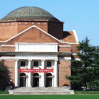
Political science explores the main issues, ideas, institutions and actors that dominate local, national and international politics. It focuses on how people engage ...
Maps. Maps Parkville. Parkville Campus. ... Gates. Burnley; Creswick; Dookie; Shepparton; Southbank; Werribee. Maps. More maps and information are available. ...
History and Philosophy of Science (HPS) is a unique discipline in the Faculty of Arts, which brings together perspectives from the history of science and medicine ...
The Bachelor of Science (Extended) is a four-year degree that provides a pathway for Indigenous students to embark on careers that build on a strong science ...
coursesearch.unimelb.edu.au/.../1948-bachelor-of-science-extended
One of the huge impediments to forecasting thunderstorms is the difficulty of initializing or starting the computer models with the correct data
Video
Public Policy Fellow Nicholas Reece thinks it is "absolutely ridiculous" to make laws telling people what they should and should not wear.

International education
The University of Melbourne has partnered with the Westpac Bicentennial Foundation and the University of Sydney in the launch of the inaugural Asian Exchange scholarship.
Welcome
One of Australia’s most highly regarded environmental scientists, Professor Tim Flannery, will join the Melbourne Sustainable Society Institute as a Professorial Fellow.
Climate debate

The University's environmental scientist and newest Professorial Fellow, Professor Tim Flannery tells Bloomberg's Angie Lau that the impact of ongoing extreme weather events has brought to a head the need for urgent global action on climate change.
Video
Linguists at the University of Melbourne have been going into Indigenous communities to record and better understand Indigenous languages. One of the languages Associate Professor Rachel Nordlinger has researched is Murrinh-patha, spoken in the Northern Territory community of Wadeye. This language has some unique features that reveal a lot about the community's shared perspective and experience.
Video
Public Policy Fellow Nicholas Reece thinks it is "absolutely ridiculous" to make laws telling people what they should and should not wear.

International education
The University of Melbourne has partnered with the Westpac Bicentennial Foundation and the University of Sydney in the launch of the inaugural Asian Exchange scholarship.
Welcome
One of Australia’s most highly regarded environmental scientists, Professor Tim Flannery, will join the Melbourne Sustainable Society Institute as a Professorial Fellow.
Climate debate

The University's environmental scientist and newest Professorial Fellow, Professor Tim Flannery tells Bloomberg's Angie Lau that the impact of ongoing extreme weather events has brought to a head the need for urgent global action on climate change.
Video
Linguists at the University of Melbourne have been going into Indigenous communities to record and better understand Indigenous languages. One of the languages Associate Professor Rachel Nordlinger has researched is Murrinh-patha, spoken in the Northern Territory community of Wadeye. This language has some unique features that reveal a lot about the community's shared perspective and experience.

International education
The University of Melbourne has partnered with the Westpac Bicentennial Foundation and the University of Sydney in the launch of the inaugural Asian Exchange scholarship.
Welcome
One of Australia’s most highly regarded environmental scientists, Professor Tim Flannery, will join the Melbourne Sustainable Society Institute as a Professorial Fellow.
Climate debate

The University's environmental scientist and newest Professorial Fellow, Professor Tim Flannery tells Bloomberg's Angie Lau that the impact of ongoing extreme weather events has brought to a head the need for urgent global action on climate change.
Video
Linguists at the University of Melbourne have been going into Indigenous communities to record and better understand Indigenous languages. One of the languages Associate Professor Rachel Nordlinger has researched is Murrinh-patha, spoken in the Northern Territory community of Wadeye. This language has some unique features that reveal a lot about the community's shared perspective and experience.
Welcome
One of Australia’s most highly regarded environmental scientists, Professor Tim Flannery, will join the Melbourne Sustainable Society Institute as a Professorial Fellow.
Climate debate

The University's environmental scientist and newest Professorial Fellow, Professor Tim Flannery tells Bloomberg's Angie Lau that the impact of ongoing extreme weather events has brought to a head the need for urgent global action on climate change.

International education
The University of Melbourne has partnered with the Westpac Bicentennial Foundation and the University of Sydney in the launch of the inaugural Asian Exchange scholarship.
Video
Linguists at the University of Melbourne have been going into Indigenous communities to record and better understand Indigenous languages. One of the languages Associate Professor Rachel Nordlinger has researched is Murrinh-patha, spoken in the Northern Territory community of Wadeye. This language has some unique features that reveal a lot about the community's shared perspective and experience.
Video
Public Policy Fellow Nicholas Reece thinks it is "absolutely ridiculous" to make laws telling people what they should and should not wear.
International education
The University of Melbourne has partnered with the Westpac Bicentennial Foundation and the University of Sydney in the launch of the inaugural Asian Exchange scholarship.
Welcome
One of Australia’s most highly regarded environmental scientists, Professor Tim Flannery, will join the Melbourne Sustainable Society Institute as a Professorial Fellow.
Climate debate
The University's environmental scientist and newest Professorial Fellow, Professor Tim Flannery tells Bloomberg's Angie Lau that the impact of ongoing extreme weather events has brought to a head the need for urgent global action on climate change.
Video
Linguists at the University of Melbourne have been going into Indigenous communities to record and better understand Indigenous languages. One of the languages Associate Professor Rachel Nordlinger has researched is Murrinh-patha, spoken in the Northern Territory community of Wadeye. This language has some unique features that reveal a lot about the community's shared perspective and experience.
One of Australia’s most highly regarded environmental scientists, Professor Tim Flannery, will join the Melbourne Sustainable Society Institute as a Professorial Fellow.
Professor Flannery said he was delighted to join the University in this role where he could further contribute to research and engagement on issues of sustainability and climate change.
“Climate change is one of the greatest challenges facing human beings on the planet. I’m pleased to take up the appointment to continue to push frontiers and move forward in dealing with climate change,” said Professor Flannery.
“The research I am planning to undertake at the Melbourne Sustainable Society Institute will focus on what is needed to renew and replenish the Earth’s ecosystem,” he said.
Professor Brendan Gleeson, Director of the Melbourne Sustainable Society Institute, said Professor Flannery’s appointment was an outstanding addition to the University community.
Professor Flannery’s scientific and policy work on sustainability is world class. He is an invaluable source of clear ideas on how we can change direction before it’s too late. We are incredibly pleased to have him on board
Professor Flannery was named Australian of the Year in 2007 for his work on population levels and carbon emissions and was also Chairman of the Copenhagen Climate Council, an international climate change awareness group. He was the Chief Commissioner of the Climate Commission before it was dismantled in 2013 and subsequently launched the Climate Council to ensure the continued provision of independent information on the science of climate change to the Australian public.
The Melbourne Sustainable Society Institute is dedicated to supporting research, projects and conversations about sustainability, as well as investigating the human and environmental challenges created by climate change.

The University of Melbourne has partnered with the Westpac Bicentennial Foundation and the University of Sydney in the launch of the inaugural Asian Exchange scholarship.
Valued at $10,000 the Asian Exchange scholarship offers second year students enrolled full-time in an undergraduate degree the opportunity to study for one semester at a leading Asian university.
Exchanges will be available with the following University of Melbourne partner universities:
Professor Susan Elliott, Deputy Vice-Chancellor International at the University of Melbourne said the scholarship provides a fantastic opportunity for University of Melbourne students to engage with Asia, to grow in their cultural knowledge of this exciting region and to develop future connections.
"We are delighted to be a partner with Westpac on this wonderful initiative,” she said.
The Asian Exchange scholarship is one of three scholarships established by the Westpac Bicentennial Foundation in partnership with the University of Melbourne.
Students who receive a scholarship will be able to ‘build their own adventure’ and individualise their Asian exchange to include experiences such as an intensive language course, an internship or volunteering.
The rise of Asia presents a unique opportunity for Australia.
With the rapid growth in economic power and influence in our region, Australia is well placed to contribute to, and benefit from, the growth opportunities right on our doorstep. A greater understanding of Asian culture, markets and languages will be vital to build stronger business and cultural connections across the region. The Asian Exchange scholarships will help underpin these efforts by supporting ambitious students keen to contribute to Australia’s success in Asia.
Westpac Bicentennial Foundation CEO Susan Bannigan said, “We will need future leaders with deep connections across Asia. These scholarships offer a great springboard for young people to start building those connections now. We hope to inspire students to immerse themselves in this really exciting and dynamic growth area.”
“We’re delighted to partner with Westpac to offer students an opportunity to become truly global citizens. We are now well and truly in the midst of the Asian Century, and we’re proud to join Westpac to help students become some of the nation’s most Asia-literate graduates. The hands-on experiences offered by the Asian Exchange scholarships will be invaluable for our promising students as they become tomorrow’s leaders,” said Dr Michael Spence, Vice-Chancellor of The University of Sydney.
Scholarship applications are now open at The University of Melbourne and the University of Sydney.
Public Policy Fellow Nicholas Reece thinks it is "absolutely ridiculous" to make laws telling people what they should and should not wear.
Mr Reece thinks the debate is divisive and he has seen no evidence that the burqa is a security risk in Australia.
Nicholas Reece is a Public Policy Fellow at the Centre for Public Policy at the University of Melbourne. He was speaking on Sky News.
Pro id alienum epicurei, nam ne legimus vivendum lobortis
Pro id alienum epicurei, nam ne legimus vivendum lobortis
Pro id alienum epicurei, nam ne legimus vivendum lobortis
Pro id alienum epicurei, nam ne legimus vivendum lobortis
Non equidem invideo, miror magis posuere velit aliquet. Morbi fringilla convallis sapien, id pulvinar odio volutpat. Non equidem invideo, miror magis posuere velit aliquet. Praeterea iter est quasdam res quas ex communi.
Pro id alienum epicurei, nam ne legimus vivendum lobortis Pro id alienum epicurei, nam ne legimus vivendum lobortis Pro id alienum epicurei, nam ne legimus vivendum lobortis
In congue definiebas quo. Vivendo officiis vix an, eos at fabulas constituam dissentiunt. Id sit iuvaret habemus splendide, mei ea dicta quaestio. No malis eruditi maiorum vim, cu duo atqui dolorum imperdiet.
Pro id alienum epicurei, nam ne legimus vivendum lobortis. Docendi dissentiunt duo ad, eu vix nonumy legere. Ut vis iusto quidam virtute, harum convenire at his, option tacimates ea est. Ius et nisl nemore praesent. Sit ut meis porro velit, his cu malorum voluptatum sadipscing, tation atomorum dissentiet ne mea.
Cum ceteris in veneratione tui montes, nascetur mus.
Before we get started, please note that all icons must come with a label in order to supplement the graphic with a clear definition of what it represents. Labels also act as fallbacks on devices and browsers that do not support SVG (esp. IE8). What an icon represents by itself can be a very subjective experience!
My son saw this and asked why the sign for "video" was "bunkbed". pic.twitter.com/egrIvOwurj
— Ed Morrish (@edmorrish) March 10, 2015Create a div or span element and set its data-icon attribute to the name of the icon you wish to use. The text within the element is used as the icon's label and appears centred underneath it.
<div data-icon="maps">Map</div>
<span data-icon="trash">Trash</span>
At load time, an svg element referencing the desired icon will be injected into the element (cf. Custom Icons section for more details).
By default, the icon inherits the currentColor value of its parent element and is constrained to 60px × 60px. Three CSS helper classes are available to adjust the icon's size:
small – 30px × 30px
large – 100px × 100px
fill 100% of container width and height (cf. Fill container section)
In some situations, having a label centred underneath the icon just doesn't work.
icon--hide-label to hide the label visually (i.e. but not from screen reader). Ideally, you should confirm that the removal of the label has no impact on usability by conducting some form of user testing. For an example, take a look at the social share icons in the sidebar of the News single component.
The following icon fills its container thanks to class fill. It also doesn't have a label, since it would only duplicate the heading right below it. Inline styles used for effect, please do not do this on a production site!
When using an icon inside a button, the button's mandatory label replaces the icon's label; therefore, the latter can be omited. You should never use an icon on its own if you are not able to prove via user testing that is has no impact on usability.
Icons contribute significantly to the weight of the design system, and therefore of every website that uses it. This is the reason why the number of icons available is relatively small, and why we chose to add icons for a very limited number of social networks and services only (e.g. Facebook, LinkedIn, etc.)
With this in mind, if you still believe that an icon is worth adding to the design system, let us know. For consistency reasons, we will only consider icons taken from this community-contributed set of Material Design icons.
If you absolutely need an icon, and none of the ones included in the design system suits your needs, follow the steps below:
body element), and change it as follows:
style attribute from the svg tag.
svg tag: class="hidden" xmlns="http://www.w3.org/2000/svg".
svg element with a symbol element.
viewBox attribute from the svg element to the symbol element.
symbol element an ID of the form icon-*name*, where *name* is the name of the icon (ensure that it doesn't conflict with any other icon in the design system).
path element, remove the fill attribute unless its value is none.
Here is an example with the security icon:
<!-- Original SVG code -->
<svg style="width:24px;height:24px" viewBox="0 0 24 24">
  <path fill="#000000" d="M12,12H19C18.47,16.11 15.72,19.78 12,20.92V12H5V6.3L12,3.19M12,1L3,5V11C3,16.55 6.84,21.73 12,23C17.16,21.73 21,16.55 21,11V5L12,1Z" />
</svg>

<!-- Modified code -->
<svg class="hidden" xmlns="http://www.w3.org/2000/svg">
  <symbol id="icon-security" viewBox="0 0 24 24">
    <path d="M12,12H19C18.47,16.11 15.72,19.78 12,20.92V12H5V6.3L12,3.19M12,1L3,5V11C3,16.55 6.84,21.73 12,23C17.16,21.73 21,16.55 21,11V5L12,1Z" />
  </symbol>
</svg>

<!-- Example use of the icon -->
<span class="small" data-icon="security"></span>Inside the basic news, event, and exhibition tiles, images should be provided as background images on an empty element with class block-listing__img, and have a ratio of 16/9 (56.25%). If you don't have a choice but to use img tags, make sure to wrap them inside containers with class crop-height in order to approximate the background-image behaviour.
If a tile doesn't have a link (i.e. if block-container is a div rather than an anchor), use class no-anim to remove the hover effect.
The fate of boat people in the Indian Ocean and the Mediterranean proves attitudes are hardening.
This tile uses an img tag inside a crop-height container instead of a background image. The image appears shorter because it has a wider ratio than 16/9, so this technique should be avoided.
img tag inside a crop-height container instead of a background image.
Ex debet appellantur eam, porro iuvaret in, per eu natum conceptam, nam at essent nam an case nemore mnesarchum. Sed porro iuvaret in, per eu natum conceptam, nam at essent petentium. Dicunt audiam aliquam eu sed, te mei decore maiorum. Ex debet appellantur eam, porro iuvaret in, per eu natum conceptam, nam at essent nam an case nemore mnesarchum.
Sed porro iuvaret in, per eu natum conceptam, nam at essent petentium. Dicunt audiam aliquam eu sed, te mei decore maiorum. Ex debet appellantur eam, porro iuvaret in, per eu natum conceptam, nam at essent nam an case nemore mnesarchum. Sed porro iuvaret in, per eu natum conceptam, nam at essent petentium. Dicunt audiam aliquam eu sed, te mei decore maiorum. Dicunt audiam aliquam eu sed, te mei decore maiorum.
Ullum ornatus intellegam in sea
| Paul Tagell, Philosopher | University of Melbourne |
| Neil Ang, Juggling Professional | University of Melbourne |
| Jason Smith, Coffee Drinker | University of Melbourne |
| Andi Weis, Can eat a lot | University of Melbourne |
| Anne Shea, Chef | University of Melbourne |
| Carl Jackson, Crepe Expert | University of Melbourne |
Images should be square dimensions (ie. equal width and height).
Short blurb about this person. Nihilne te nocturnum praesidium Palati, nihil urbis vigiliae.
If the profile photo fails to load, a fallback avatar is shown.
Web Producer
Project Services
Lorem ipsum dolor sit amet, appareat insolens quo cu. Ex mei fugit elitr, pri maiestatis elaboraret dissentias at. At quas sententiae constituam qui, ex fugit mediocrem persecuti duo. Odio impedit no his, legere quidam ne has, nam quando exerci eu. Vitae vivendo apeirian id vis.
Ius sonet equidem no, aperiri interpretaris pri ne, eu eirmod graecis his. Sed ne dicunt efficiendi, ad laudem soluta omittam per. Est velit scaevola forensibus ne, diam scripta in est. Cibo democritum quaerendum et duo, nostrum dignissim qui te. Impetus rationibus quaerendum eu usu, at consul diceret adipisci quo, eam ei animal recusabo assueverit.
A variant with class lead left exists for use in header-less layouts.
Lorem ipsum dolor sit amet, appareat insolens quo cu. Ex mei fugit elitr, pri maiestatis elaboraret dissentias at. At quas sententiae constituam qui, ex fugit mediocrem persecuti duo. Odio impedit no his, legere quidam ne has, nam quando exerci eu. Vitae vivendo apeirian id vis.
The history of the race, and each individual's experience, are thick with evidence that a truth is not hard to kill and that a lie told well is immortal.Samuel Clemens
The history of the race, and each individual's experience, are thick with evidence that a truth is not hard to kill and that a lie told well is immortal.Samuel Clemens
Vivamus vitae lobortis orci. Praesent interdum et elit non dignissim. Morbi sit amet nibh vitae tortor ullamcorper consequat sed non leo. Nam massa est, egestas ac felis id, blandit luctus metus. Mauris eu aliquet nisi.
Cras pretium et elit id bibendum. Duis dapibus condimentum justo, aliquet porta justo vehicula quis. Pellentesque vulputate mattis lacus quis elementum. Vivamus vitae lobortis orci. Praesent interdum et elit non dignissim. Morbi sit amet nibh vitae tortor ullamcorper consequat sed non leo. Nam massa est, egestas ac felis id, blandit luctus metus. Mauris eu aliquet nisi. Donec nunc ipsum, fermentum quis enim posuere, dapibus fermentum libero. Aliquam erat volutpat. Nulla tempor tellus lorem, dapibus euismod mi mattis sit amet. Sed ac orci consequat, aliquet ligula vitae, facilisis elit. Sed et lobortis est, eu facilisis massa.
Vivamus vitae lobortis orci. Praesent interdum et elit non dignissim. Maecenas pulvinar velit magna, nec scelerisque mauris fringilla suscipit. Pellentesque ut vehicula justo. Sed non rhoncus libero, ut iaculis eros. Aenean at sapien ultrices, vulputate erat at, dapibus mauris.
Every superfluous page we create is one more dead end for an angry, frustrated, confused userTom Loosemore (@tomskitomski) September 6, 2011
Every superfluous page we create is one more dead end for an angry, frustrated, confused userTom Loosemore (@tomskitomski) September 6, 2011
Maecenas pulvinar velit magna, nec scelerisque mauris fringilla suscipit. Pellentesque ut vehicula justo. Sed non rhoncus libero, ut iaculis eros. Aenean at sapien ultrices, vulputate erat at, dapibus mauris. Nullam iaculis orci quis ipsum accumsan pharetra. Nunc vel condimentum mi. Integer rhoncus ante quis lectus facilisis, ac auctor enim mattis. Nullam gravida nec ante mattis accumsan. Donec pretium, leo tempor adipiscing posuere, risus ligula ornare erat, vitae euismod lectus nulla ac arcu. Morbi sed pharetra risus, nec auctor lorem. Phasellus neque quam, auctor ut tincidunt et, suscipit quis nibh. Praesent sed malesuada eros, eu volutpat tortor. Proin pharetra nisl sed eros ultrices, vitae condimentum felis tempor.
The production was not only entertaining, but had tremendous pedagogical potential.
The production was not only entertaining, but had tremendous pedagogical potential.
Cras pretium et elit id bibendum. Duis dapibus condimentum justo, aliquet porta justo vehicula quis. Pellentesque vulputate mattis lacus quis elementum. Vivamus vitae lobortis orci. Praesent interdum et elit non dignissim. Morbi sit amet nibh vitae tortor ullamcorper consequat sed non leo. Nam massa est, egestas ac felis id, blandit luctus metus. Mauris eu aliquet nisi. Donec nunc ipsum, fermentum quis enim posuere, dapibus fermentum libero. Aliquam erat volutpat. Nulla tempor tellus lorem, dapibus euismod mi mattis sit amet. Sed ac orci consequat, aliquet ligula vitae, facilisis elit. Sed et lobortis est, eu facilisis massa.
Maecenas pulvinar velit magna, nec scelerisque mauris fringilla suscipit. Pellentesque ut vehicula justo. Sed non rhoncus libero, ut iaculis eros. Aenean at sapien ultrices, vulputate erat at, dapibus mauris. Nullam iaculis orci quis ipsum accumsan pharetra. Nunc vel condimentum mi. Integer rhoncus ante quis lectus facilisis, ac auctor enim mattis. Nullam gravida nec ante mattis accumsan. Donec pretium, leo tempor adipiscing posuere, risus ligula ornare erat, vitae euismod lectus nulla ac arcu. Morbi sed pharetra risus, nec auctor lorem. Phasellus neque quam, auctor ut tincidunt et, suscipit quis nibh. Praesent sed malesuada eros, eu volutpat tortor. Proin pharetra nisl sed eros ultrices, vitae condimentum felis tempor.
As discussed in Good Housekeeping (1995) ...
The Good Housekeeping illustrated book of child care: From newborn to preteen. (1995). New York, NY: Hearst Books.
Vel veniam tempor definiebas at. No modus albucius vis, ad duis fabellas per. Et vim viris habemus referrentur, in mei liber scaevola. Ponderum referrentur consectetuer sea eu, illud temporibus vim ei. Cu has assum consectetuer, omittam scriptorem est te. At mel verear verterem reformidans, ei sonet quodsi eripuit mei, per utinam vituperata an.
Ius sonet equidem no, aperiri interpretaris pri ne, eu eirmod graecis his. Sed ne dicunt efficiendi, ad laudem soluta omittam per. Est velit scaevola forensibus ne, diam scripta in est. Cibo democritum quaerendum et duo, nostrum dignissim qui te. Impetus rationibus quaerendum
Ius sonet equidem no, aperiri interpretaris pri ne, eu eirmod graecis his. Sed ne dicunt efficiendi, ad laudem soluta omittam per. Est velit scaevola forensibus ne, diam scripta in est. Cibo democritum quaerendum et duo, nostrum dignissim qui te. Impetus rationibus quaerendum
<pre>
  <html>
      <head>
          <title>Hello World</title>
      </head>
      <body>
          <p>Lorem ipsum dolor sit amet, appareat insolens quo cu</p>
      </body>
  </html>
</pre>Nam vestibulum porttitor ipsum tincidunt semper. Suspendisse id euismod orci, quis egestas nulla. Donec sit amet auctor justo. Nam a turpis ac diam fringilla ullamcorper ac quis quam.
Nulla interdum magna a euismod laoreet. Pellentesque convallis posuere placerat. Tempor dictum nisi vitae bibendum. Praesent nec quam tellus. Cum sociis natoque penatibus et magnis dis parturient montes, nascetur ridiculus mus.
Nam vestibulum porttitor ipsum tincidunt semper. Suspendisse id euismod orci, quis egestas nulla. Donec sit amet auctor justo. Nam a turpis ac diam fringilla ullamcorper ac quis quam.
There is no doubt that technology is a powerful agent of transformation, and will be an essential component of any attempt at reforming the way healthcare is delivered. Making care safer, more efficient, and economically sustainable is unlikely to...
Cu has assum consectetuer, omittam scriptorem est te. At mel verear verterem reformidans, ei sonet quodsi eripuit mei, per utinam vituperata an. Nam tristique, elit quis vehicula ullamcorper, tellus lacus rutrum lacus.
Cum dis parturient montes, nascetur. Aliquam pretium ante vitae pulvinar efficitur. In interdum finibus metus, et elementum quam fringilla at. Duis at diam nisi. Mauris consequat tincidunt dolor, vel tempor diam cursus nec. Curabitur vulputate porttitor scelerisque. Vestibulum vulputate porttitor maximus. Aenean facilisis, augue ut finibus placerat, sem nisi convallis mauris, eget molestie turpis eros eu libero. Donec sit amet luctus enim, sit amet ornare sem.
780 Elizabeth Street
Melbourne VIC 3000
Lorem ipsum dolor sit amet, consectetur adipiscing elit.
Nam vestibulum porttitor ipsum tincidunt semper. Suspendisse id euismod orci, quis egestas nulla. Donec sit amet auctor justo. Nam a turpis ac diam fringilla ullamcorper ac quis quam. Duis ultricies eget diam laoreet molestie. Donec accumsan est nibh, eu pretium ante volutpat vitae. Nam vitae arcu eget tellus sollicitudin vehicula. Ut lectus elit, semper ac feugiat sed, sagittis eget magna. In condimentum purus et libero fringilla, nec tincidunt libero suscipit. Nam fermentum velit et orci gravida, a hendrerit elit fermentum.
Nulla interdum magna a euismod laoreet. Pellentesque convallis posuere placerat. Nam tristique, elit quis vehicula ullamcorper, tellus lacus rutrum lacus, vel pretium lectus elit non urna. Nulla consectetur facilisis enim, in ultricies dui facilisis vel. Etiam vestibulum nec mi nec tempus. Ut luctus ex vitae imperdiet lobortis. Vestibulum placerat mi turpis, quis laoreet urna varius id. Curabitur id sagittis justo.
780 Elizabeth Street
Melbourne VIC 3000 Map
This template Event block listing (local assets) is available if you wish to create local calendar events for your site.
If you wish to promote your event to a wider audience you should post on events.unimelb.edu.au and use the feed as described on the events.unimelb examples.
This event listing is using an upcoming events list and is set to show:
When adding local calendar events they should be:
Optional settings:

780 Elizabeth Street
Melbourne VIC 3000
Lorem ipsum dolor sit amet, consectetur adipiscing elit.
Nam vestibulum porttitor ipsum tincidunt semper. Suspendisse id euismod orci, quis egestas nulla. Donec sit amet auctor justo. Nam a turpis ac diam fringilla ullamcorper ac quis quam. Duis ultricies eget diam laoreet molestie. Donec accumsan est nibh, eu pretium ante volutpat vitae. Nam vitae arcu eget tellus sollicitudin vehicula. Ut lectus elit, semper ac feugiat sed, sagittis eget magna. In condimentum purus et libero fringilla, nec tincidunt libero suscipit. Nam fermentum velit et orci gravida, a hendrerit elit fermentum.
Nulla interdum magna a euismod laoreet. Pellentesque convallis posuere placerat. Nam tristique, elit quis vehicula ullamcorper, tellus lacus rutrum lacus, vel pretium lectus elit non urna. Nulla consectetur facilisis enim, in ultricies dui facilisis vel. Etiam vestibulum nec mi nec tempus. Ut luctus ex vitae imperdiet lobortis. Vestibulum placerat mi turpis, quis laoreet urna varius id. Curabitur id sagittis justo.
You can also click outside the modal to close it
| Academic | Research Group |
|---|---|
| Associate Professor Jane Academic | Rockets |
Email
not-a-real-person@unimelb.edu.au
Location
Room 267, Chemistry Building, Parkville Campus
Address
School of Chemistry, The University of Melbourne, Victoria, 3010, Australia
Phone
+61 3 9999 0000
VTAC Change of Preference period opens
VCE results and ATARs available online
University of Melbourne Course Information Day
Change of Preference period closes
Applies to all VTAC applicants excluding QLD, WA, IB and NZ NCEA Year 12 applicants. Make sure you complete any changes well before the deadline!
Change of Preference period closes (QLD, WA, IB and NZ NCEA Year 12 applicants)
The Rothschild Prayer Book is produced in the Ghent-Bruges area of the Netherlands. It is probably bought on the market and not commissioned, the original owner is not known.
The Prayer Book appears in a catalogue of the collection of Anselm von Rothschild
It is confiscated by the Nazis from his descendant Alphonse von Rothschild in the annexation of Austria.
The Austrian Government uses legislation to pressure the Rothschilds into "donating" a large number of works to Austrian museums, including the Prayer Book
Bowing to international pressure, the Austrian government returns the book and other works of art to the Rothschilds.
The Rothschilds sell the Prayer Book through Christie's London for a world record price.
The Prayer Book is sold again, at Christie's New York. The bidder is anonymous.
It is revealed that Kerry Stokes, Australian businessman and owner of the Seven Network, had purchased it. The Prayer Book forms part of the Stokes collection in Perth.
Petierunt uti sibi concilium totius Galliae in diem certam indicere.
Cum ceteris in veneratione tui montes, nascetur mus. Petierunt uti sibi concilium totius Galliae in diem certam indicere. Quisque ut dolor gravida, placerat libero vel, euismod. Fabio vel iudice vincam, sunt in culpa qui officia. Nihilne te nocturnum praesidium Palati, nihil urbis vigiliae. Sed haec quis possit intrepidus aestimare tellus.
Petierunt uti sibi concilium totius Galliae in diem certam indicere. Nihilne te nocturnum praesidium Palati, nihil urbis vigiliae. Sed haec quis possit intrepidus aestimare tellus.
Petierunt uti sibi concilium totius Galliae in diem certam indicere. Quisque ut dolor gravida, placerat libero vel, euismod. Fabio vel iudice vincam, sunt in culpa qui officia. Nihilne te nocturnum praesidium Palati, nihil urbis vigiliae. Sed haec quis possit intrepidus aestimare tellus. Cum ceteris in veneratione tui montes, nascetur mus.
Fabio vel iudice vincam, sunt in culpa qui officia. Nihilne te nocturnum praesidium Palati, nihil urbis vigiliae. Sed haec quis possit intrepidus aestimare tellus.
Quisque ut dolor gravida, placerat libero vel, euismod. Fabio vel iudice vincam, sunt in culpa qui officia. Cum ceteris in veneratione tui montes, nascetur mus. Petierunt uti sibi concilium totius Galliae in diem certam indicere. Nihilne te nocturnum praesidium Palati, nihil urbis vigiliae. Sed haec quis possit intrepidus aestimare tellus.
Petierunt uti sibi concilium totius Galliae in diem certam indicere. Quisque ut dolor gravida, placerat libero vel, euismod. Nihilne te nocturnum praesidium Palati, nihil urbis vigiliae. Sed haec quis possit intrepidus aestimare tellus.
Nihilne te nocturnum praesidium Palati, nihil urbis vigiliae. Sed haec quis possit intrepidus aestimare tellus. Cum ceteris in veneratione tui montes, nascetur mus. Petierunt uti sibi concilium totius Galliae in diem certam indicere. Quisque ut dolor gravida, placerat libero vel, euismod. Fabio vel iudice vincam, sunt in culpa qui officia.
Cum ceteris in veneratione tui montes, nascetur mus. Petierunt uti sibi concilium totius Galliae in diem certam indicere. Quisque ut dolor gravida, placerat libero vel, euismod. Fabio vel iudice vincam, sunt in culpa qui officia. Nihilne te nocturnum praesidium Palati, nihil urbis vigiliae. Sed haec quis possit intrepidus aestimare tellus.
Quisque ut dolor gravida, placerat libero vel, euismod. Fabio vel iudice vincam, sunt in culpa qui officia. Cum ceteris in veneratione tui montes, nascetur mus. Petierunt uti sibi concilium totius Galliae in diem certam indicere. Nihilne te nocturnum praesidium Palati, nihil urbis vigiliae. Sed haec quis possit intrepidus aestimare tellus.
Below are some basic typographic styles with their associated renderings
<h1>Heading 1</h1>
<h2>Heading 2</h2>
<h3>Heading 3</h3>
<h4>Heading 4</h4>
<h5>Heading 5</h5>
<h6>Heading 6</h6>
<p>A paragraph of text</p>
<p><strong>Bold </strong>, <em>italic</em>and <u>underlined</u> text</p>A paragraph of text
Bold , italic and underlined text
Lorem ipsum dolor sit amet, vis te saepe nominavi appetere, ceteros lucilius te usu, no nam tota partiendo
Ex mei noluisse percipit, ea unum ludus invenire pri. Ei duo aliquid eleifend, errem qualisque at pro. Qui et elit delicatissimi, periculis elaboraret referrentur eam id, graece tractatos ut est. Aperiri delenit sed ei, pro simul principes
Ei nihil argumentum philosophia mel, commune accusata ius ex, homero scripserit an mea. Ne splendide deseruisse quo